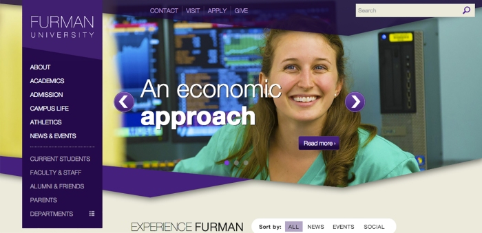
Furman University’s Marketing and Public Relations department recently finished a two year long process of website redesign in an effort to make it more mobile accessible, attract prospective students and alumni, and make internal access easier.
Not everyone has been a fan of the changes though. English Department Chair Lynn Shackelford said that she and several colleagues disagree with the way the website represents Furman, which she argues downplays the rigorous academics with images and texts that only show the social aspects of the school.
“I think the new website is very visually appealing, but I was bothered by the motto, ‘Where beauty meets brains,’” she said. “Even though I understood it was trying to promote the beauty of the campus … it sounded like a dating situation.”
Mark Kelly, Vice President for Marketing and Public Relations, said he sees the renovation as a positive shift for Furman University in an age where keeping up with the latest trends is a must to remain a competitive university. He said the website needed “a consistency to the look and feel” and is one of many that believe the website has achieved this goal. He did admit, though, that the number one goal of the redesign was to recruit prospective students.
“Over 70 percent of our revenue comes from undergraduate tuition. It is pretty easy to make priority decisions when you know that,” Kelly said.
Kelly also stated that there are plenty of benefits to the website, both internally and externally, adding that the redesign standardizes the look and feel of Furman’s web presence. He suggested that, though the website was unfamiliar at first, the Furman community would eventually grow accustomed to it.
“You know, we’ve had some complaints that they can’t find their way. Every website redesign — I’ve heard the same thing. Eventually people figure it out,” Kelly said.
Shackelford said believes that a better introduction and more preparation about the new site would have made the transition much easier. But she commended some parts of the website, such as the feature stories and videos, which she said could be an exciting way to showcase the interesting careers that alumni are pursuing.
“It’s been a learning process for everyone involved … but I think the end result is going to be very positive,” she said.
There are many changes that come with the redesign, including mobile access and uniform visibility. Kelly said he believes that, despite the critiques, the website fits many of the criteria for Furman’s new approach to marketing and will encourage web visitors to connect with the university.
“It’s one piece of many things … I hope the website gets people engaged, to want to be a part of Furman University,” he said.

